Wednesday 26 February 2014

Changes - putting in the text


This is what the posters now look like with text. Each one of them starts off with 'Enjoy...'
and states the website for the National Trust.

Final changes

On showing how my posters have progressed and changed since crit, I was given some more suggested changes and tweaks that I could do. It suggested that I moved the box so that it went straight across the page. Have the text so that it went straight across and move the logo on to the left hand size. Also it was suggested that I made the key hole image bigger so that it touched the top of the box.


This is the result I got from making the changes and I am really pleased with how they come out. I have now credited the images as well, I just need to add some text underneath. I have also changed some of the colours of the posters, which I have taken from the colour scheme. 

Sunday 23 February 2014

Changes - Putting them all together


This is the result so far, although I have done eight these are just some of them. I still need to credit the photos and add some extra text underneath the tagline.


Thursday 20 February 2014

Changes - Putting in text

One of the questions that I asked the group was what they thought the tagline should be, as it was one part which I was struggling with. Some which were suggested were:

"Discover the National Trust"
"National Trust, a key to a good day out"
"Unlock the..."

Out of the ones which were suggested I particularly like the first one, although when it came to adding it to my posters I added 'new', so it was now "Discover the new National Trust"


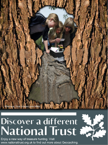
This is one of my posters. When I added the text with this tagline: "Discover the new National Trust"
I found that the 'new' wasn't really appropriate as the National Trust isn't something new. On thinking this I decided to go with 'different' which I found made more sense given that the idea of the campaign is different the typical stereotype of old people.

Tuesday 18 February 2014

Changes - Keyhole cut out


These are the keyhole cut outs for each of the posters. Using an image of a keyhole as a guide, I used the pen tool and went round it, I created a path and deleted the section. I added a shadow to make it look a bit more 3D and then was ready to add the images behind the keyhole.