I really like this thought of having a keyhole.
KEYHOLE
- could have doors with keyholes
- alternatively have the keyhole like embossed or cut out on things
Use the keyhole idea as a concept on everything, like in the mud - having the keyhole in the mud - 'unlocking' the fun in the mud
My current thought is 'Through the keyhole'
My thinking behind this concept is unlocking a kind of different to the National Trust, rather than the one everyone typically thinks of, which is that it is for the elderly.
In my sketch book, I have started to to brainstorm ideas and sketch some thoughts.
I was thinking of places to do with the National Trust and thinking how I could incorporate the keyhole idea.
Initially I thought of beaches and things like the deck chairs and beach huts having a key hole cut out and within that having an image which is related to the beach.
Other places and things which I thought of is castles and having the brick work cut out in a keyhole, gardens and having hedges cut out.
Sunday 22 December 2013
Friday 20 December 2013
Ideas
I have struggled a bit with thinking of a solid idea for the posters. It's hard trying to think of something new and appeal for the target audience of 25-40, whilst avoiding the stereotypes of the National Trust being for the elderly.
On a piece of paper, I started by writing down questions in order to help with coming up concepts
What prevents people from going to the National Trust?
- The price
- Some people don't even think about it
- The lack of knowledge towards the National Trust
- They more than likely think its just going to full of old/elderly people and upper class people
How do you make the National Trust trendy?
What are the benefits to visiting the National Trust?
Notes:
Older people/ Grandparents are the traditional audience for the National Trust - if they are encouraged to take their Grandchildren - they'll then grow up to appreciate and want to go to the National Trust.
'National Trust pass it on'
*Maybe using the connotations and having the words on a poster and an image to images around the world which will target 25-40 year olds (in my sketchbook I have a list of connotations)
Combining the connotations of the stereotypes of the National Trust with the connotations of the target audience
Ideas
Something to do with silhouettes
Through the keyhole theme
|
Something to do with doors - opening doors
The words/phrases make appropriate to the target audience
The idea of unlocking
Wednesday 18 December 2013
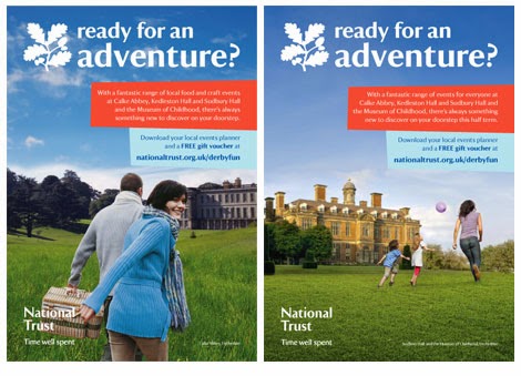
Previous National Trust Campaigns

"The National Trust required an integrated campaign to challenge perceptions that they were not open in the Autumn and winter months and maximise the number of visitors to their attractions in the spring and summer months. In addition to offline media such as outdoor posters and press advertising Guerilla asked our client to consider online media, which had not previously been used by the National Trust to grow visitor numbers.
Guerilla planned an online display advertising campaign that involved a carefully selected mix of skyscraper and MPU formats. The flash advert platforms were created to add the activities and sites that could be achieved when the viewer had ‘time to...’. The seasonal campaign images reflected the time of year or event such as Easter and Summer, and the specific venue images and associated lines were also changed to allow several venues to be promoted."

"The National Trust has just released their latest advertising campaign, which consists of posters designed by The Click Design Consultants. Initially, these posters look like warning signs to visitors but in actual fact they are quite the opposite. They are very light hearted and encourage visitors to get involved with the surroundings and have fun.
Hashtags have been added to the designs saying ‘NaturesPlayground’ to encourage visitors to tweet and share about their experience at one of the sites."
Previous National Trust Campaigns
These are some National Trust campaigns which I found
"Following a successful pitch we were appointed to manage marketing communication for 40 of the National Trust's leading properties.
To help encourage visits, we developed a wide range of creative element across all kinds of media, which have included a Royal Mail door drop, press inserts in major national newspapers, regional press adverts, outdoor advertising, online ads and even radio advertising."

"We have been working closely with the National Trust for the last three years and in this time have created a sustainable relationship based on our understanding of their brand, creativity and our flexibility. dtwo currently create and manage their press and poster advertising campaigns and promotional literature for the South West area. We work closely with their marketing department and photographers and liaise directly with publications and printers. This benefits the National Trust in giving them ‘peace of mind’ that they work with a professional established agency to handle this type of work in volume."
Monday 16 December 2013
The National Trust
During another one of our sessions, we spent the lesson going through each of the briefs which I found to be really useful. From going through each of the briefs and discussing what each one is asking and the requirements, it helped with eliminating the ones I didn't want to do.

The National Trust was one of the briefs that appealed to me. As there were a few people who had an interest in doing this brief as well, we got into a group to start discussing ideas, highlighting the key parts of the brief and looking to see the requirements they were after.
Once we had highlighted the brief, we took out the bits that we thought were important and put the bits together to make like a paragraph.
Reintroduce powerful connectors between people and places. Rebuilding connection modern audience. Importance of nature and heritage. Elderly equals cream teas. Reposition the National Trust away from its current perceived image. Integrated campaign nature and beauty forever. Consider make time areas of natural or historic beauty change perception, old fashions benefits people's lives. Think campaign relevant reach audience, 25-40 years old nationwide in the UK.
This is the paragraph that we got from the bits which we have highlighted. I found this made it easier in terms of discussion due to the fact there wasn't much text to go through and it also meant we didn't have to keep going over the brief picking out the key bits of information.
Some rough ideas that we had was playing on the idea of 'trust' - restatement of what the 'trust' is - who else could we trust to look after the assists of the national trust
Finding a new way to represent the national trust - steering away from the typical stereotype perception
TRUST - responsibility, have faith/belief, looking after
ASOS Brief

In a small group we had a look through this brief, highlighting what we thought were the key bits of information. We were also given questions to answer to help us to understand the requirements of the brief.
Target Audience: Fashion loving 20 somethings who are price conscious, unisex or female only
What's the brief asking you to do? To create a design concept to shoe what could be next after street that can be viewed on a smartphone
Is the brief specific - about time or place? Future, worldwide (global)
Why are they asking you to do this? There is a change in the way you shop
How are they asking you to do this? App or site, presented in a video, don't have to make an app or site. Sharable concept which is/ can be viewable on a smartphone. UGC (user generated content) to make it customisable to suit viewers lifestyle
When we were going through each of the briefs and we were discussing this one, we were thinking of ways in which we could do it. We had a a brief discussion on art styles and one which was suggested was fashion illustrations. I've had a look at David Downton who does a lot of fashion illustrations. These five below which I have picked out are just some of the illustrations that he has done.


Saturday 14 December 2013
The Briefs
Having received the brief and the list of potential briefs which we could choose from, I went on to sign up on the D&AD website so that I could download and go through the briefs.


http://www.dandad.org/awards/new-blood/2014
Once I downloaded the briefs, I then printed the ones which were on the list and went through them with a highlighter to pick out the important bits.


Saturday 7 December 2013
Project Two: D&AD New Blood Awards
The Brief
A digital copy of all the briefs can be downloaded at: www.dandad.org/awards/new-blood/2014
You must choose one of the following briefs set for the New Blood (D&AD) Awards. Bare in mind your points and experience and which projects might be appropriate for your personal learning and development. You can work as a team for this brief but you must present your case to the course leader and get the go ahead.
These are the briefs which we can choose from:
ASOS
BBC
D&AD
Digital Cinema Media
National Trust
Npower
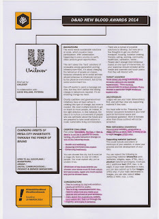
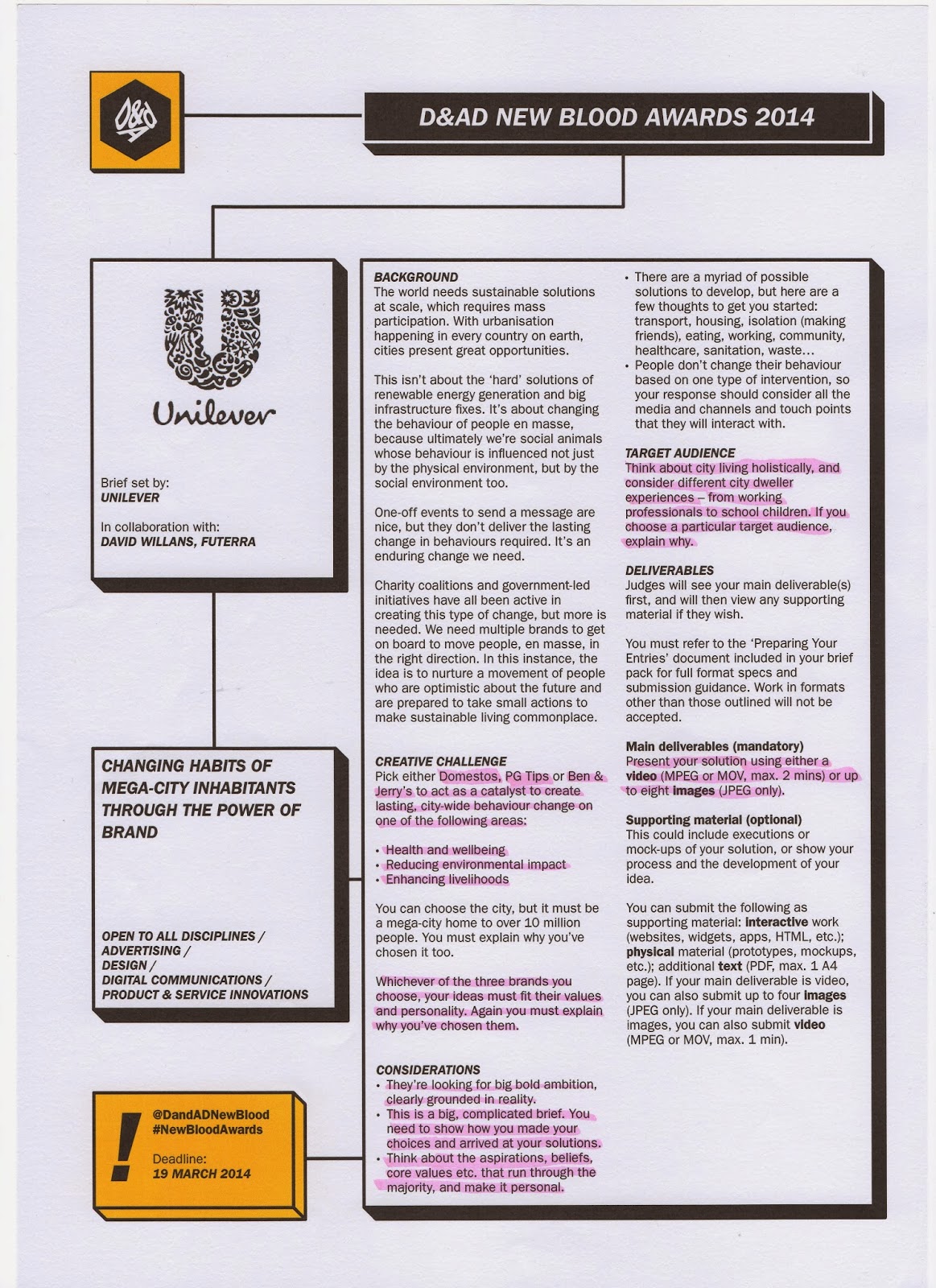
Unilever
WPP
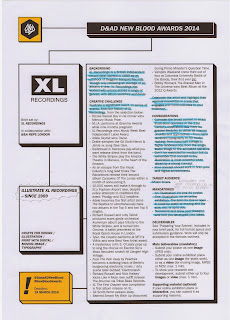
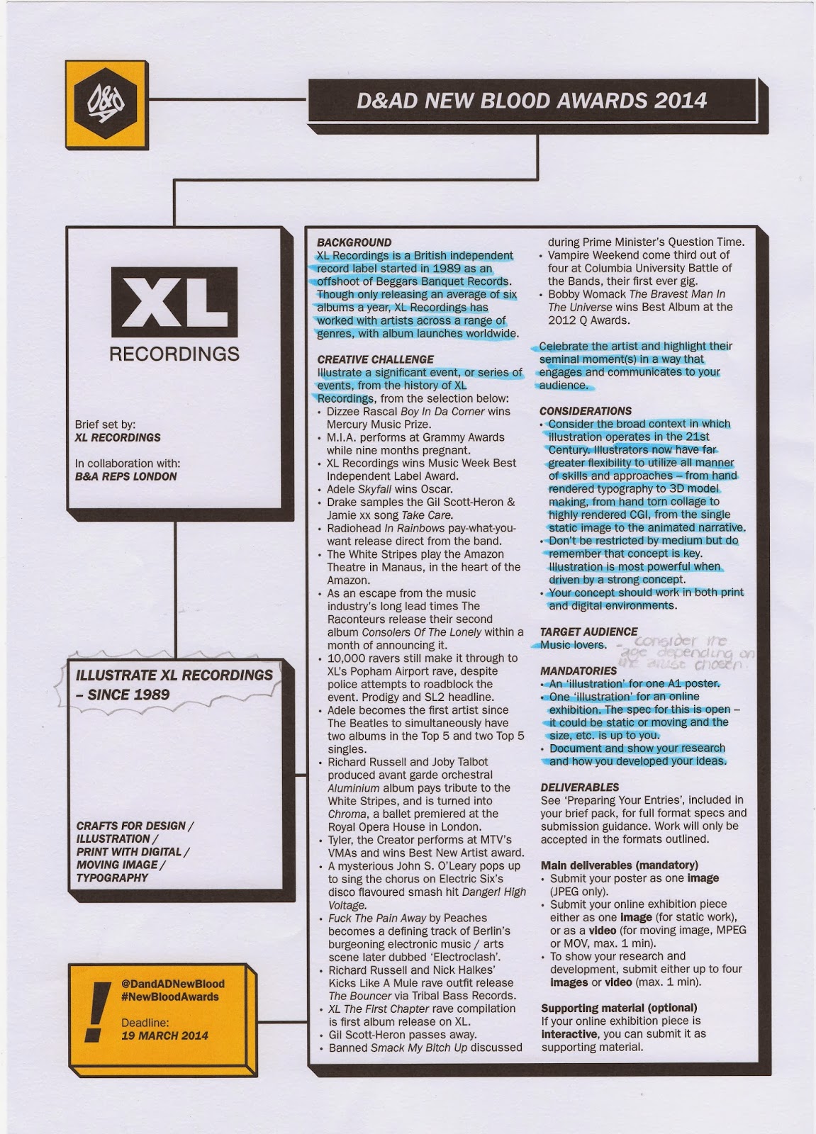
XL Recordings
Key Dates
Wednesday 15th January - Planning Deadline
Wednesday 12th February - Crit
Thursday 28th February - Deadline
A digital copy of all the briefs can be downloaded at: www.dandad.org/awards/new-blood/2014
You must choose one of the following briefs set for the New Blood (D&AD) Awards. Bare in mind your points and experience and which projects might be appropriate for your personal learning and development. You can work as a team for this brief but you must present your case to the course leader and get the go ahead.
These are the briefs which we can choose from:
ASOS
BBC
D&AD
Digital Cinema Media
National Trust
Npower
Unilever
WPP
XL Recordings
Key Dates
Wednesday 15th January - Planning Deadline
Wednesday 12th February - Crit
Thursday 28th February - Deadline
Monday 2 December 2013
Final Storyboard
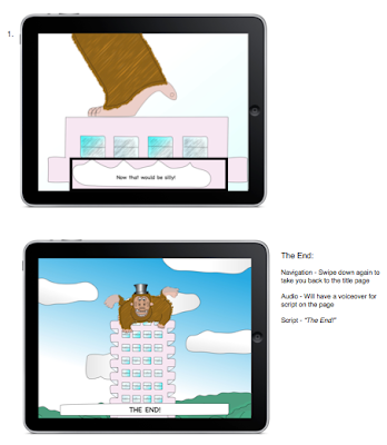
This is my final storyboard after I have made the relevant changes which were I received from crit.


Thursday 28 November 2013
Crit
These were the points which I received from Crit yesterday.
Storyboard Changes:
Sort out the text in the storyboard (get rid of the word 'likely', don't repeat the navigation on each page if its the same - sort out some of the navigation so that it is pinching rather than swiping across)
For the room like with the Man and the typewriter instead of having 2 separate images in the storyboard, have a box around the bit that changes (the rubbish in the bin) - there is no need to repeat the images
Sort out the blurriness of the images on the storyboard
Make some of the visuals brighter - pick out the best scenes and make the other match up to that
Video Changes:
Sort out the pace of the video and make it some of it a bit slower - there are points in the video where it jumps and goes really quick
Have the pinch fingers in some of the navigation instead of swipe
Show a bit more of the rooms with the interactivity
Include sound - sound effects
Arrows or text to indicate the navigation
Have the speech bubbles appear once the scene has appeared rather than automatically on there
Instead of the typewriter typing 'hello', have it do a random word like this: nbfbjksdmncakms
Friday 22 November 2013
Monday 18 November 2013


Tuesday 5 November 2013
Brighton Trip - Cogapp and Clearleft
Yesterday we all went on a trip to Brighton to visit Cogapp and Clearleft.

At Cogapp we learnt about Information Architecture, which was really interesting as well as also doing some group work with organising information into different categories.
*Notes*
Information Architecture - getting content and organising it so that it makes sense to the user.
L ocation - geographical, medical
A lphabetical - good for organising huge amount of information
T ime - History, organising things like a blog
C ategory - Most complicated
H ierarchy - by order or number/ most popular
"I found the visit to Cogapp interesting and informative. When I arrived there I wasn't overly sure as to what an Information Architect was but on leaving I had a clear idea as to what the role involved. Also it was useful looking at different ways to sort and categorise information and doing the card sorting helped with getting an idea of what to do."

I found this visit really interesting and informative with the idea of user experience and user testing. I had no idea of the process that needs to be take in order to get a good result from user testing.

This is the bit of software that we used in groups of 3 to do our own mock user testing based on a scenario that we came up with. In the group one person was the moderator, one was participator and the final person was observing.
"I found the visit to Clearleft interesting and really helpful. It was really good to see how user testing is done in the industry and what the process is like. Although it was a bit uncomfortable, I found it really good to work in groups and do our own user testing with the Silverback software. I found it useful experiencing both the role of the moderator and the participator and finding out the time which needs to be taken for the moderator in order to get the best user testing result."
Tuesday 29 October 2013
Research/ Graphic Style
When it came to deciding on the graphic style that I wanted to use, I wasn't overly sure as to how I wanted it to look.
The first thing that I did was find out the age that the book is targeted for; to find this out I went on the publisher's (Walker) website. On having a look on the site, I found out that the age for the book is 4+.

http://www.walker.co.uk/Who-s-That-Banging-on-the-Ceiling-9781406347364.aspx
After finding this out, I then went on to have a look at existing books for the age group, and I did this on the WH Smith website.

http://www.whsmith.co.uk/dept/books-fiction-75759/home?filters=&hierarchyPath=/3/ TOP_NAVIGATION/wc_dept_books/wc_dept_books_childrens_01540/ wc_dept_books_fiction_75759&page=1&results=60&sort=asc_bestSellerRanking
From having a look through the website and at the covers which I have picked out, I found that there wasnʼt that many books which used block colour, but instead used shadows and had a lot of detail in the drawings. This got me thinking about how I wanted my images to look as one of my initial thoughts was that I wanted it block and bright, but having had a look at the drawings on these books Iʼm changing my mind with the style and thinking that I am going with using drop shadow and gradients; to give my images more detail.


Subscribe to:
Posts (Atom)